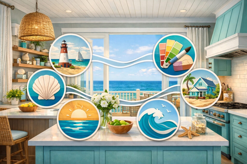
Coastal Delaware kitchens have a particular “real life” rhythm—salt air drifting in from open sliders, sandy feet padding across the floor, humidity rising after a crab boil, and bright natural light bouncing off every surface.
If your home is in Rehoboth, Lewes, Bethany, or Fenwick, you’ve probably also got a mix of high-traffic weekends, guests who “live in the kitchen,” and (for many homeowners) the extra wear that comes with rental turnover.
That’s why choosing quartz here isn’t only about what looks pretty on a sample board. It’s about picking a color that stays calm in intense daylight, plays nicely with coastal paint colors, and still looks clean after a day of sunscreen, beach snacks, and sand.
In this guide, I’ll walk you through a simple, practical framework and then break down the best quartz countertop colors for coastal Delaware kitchens by color family—what each one looks like, what it pairs with, where it shines, and where it can go wrong.
What makes Delaware coastal kitchens unique (and why color choice matters)
Coastal Delaware homes often have a few design “ingredients” that affect countertop color more than people expect.
- Light: Beach towns tend to have expansive windows, lighter window treatments, and reflective views (water, sky, pale decking). That means quartz can look brighter and higher-contrast than it would inland. A “soft white” in a showroom can read like a crisp, almost icy white in a Lewes kitchen at 2 p.m.
- Salt air + humidity: While quartz itself is non-porous and very low maintenance, the overall environment can influence your design choices—especially when it comes to finishes (glare), grout selection, and hardware that won’t show spots.
- Sand and traffic: Delaware beach homes often have direct lines from exterior doors to the kitchen. Sand, crumbs, and tiny grit particles show up fast—especially on pure white, high-polish surfaces under strong light.
- Rental turnover and “real use:” Even if you aren’t renting, coastal homes tend to host: family weekends, holiday crowds, friends stopping by after the beach. A quartz color that hides daily life gracefully can feel like a huge quality-of-life upgrade.
- Coastal color palettes: Many Delaware coastal kitchens lean into whites, warm neutrals, soft woods, ocean blues, sea-glass greens, and airy grays. Quartz undertones (warm vs cool) can either harmonize—or quietly clash—depending on what else is in the room.
A practical color-selection framework that actually works
Before you fall in love with a slab photo, use this framework to narrow your choices. It keeps you from choosing a quartz color that looks perfect alone—but “off” once it’s installed.
Start with light: north/south exposure and time of day
Natural light direction matters more than most coastal homeowners realize.
A north-facing kitchen often gets cooler, steadier light. Whites can look crisper; grays can look more blue; warm tones can look muted. This is where cool-white quartz can feel clean and intentional, and warm whites can sometimes look slightly dull if they don’t have enough brightness.
A south-facing kitchen gets warmer, more direct sun. Many whites read warmer; beige tones glow; heavy veining can feel extra bold. In these kitchens, overly cool quartz can look stark against warm floors and sunlight.
East-facing kitchens get bright morning light that can emphasize cool undertones. West-facing kitchens get golden afternoon light that amplifies warm undertones and can exaggerate creaminess.
Match cabinet color first, then quartz undertones
Cabinet color is your largest “color block,” so it’s your anchor.
- Bright white cabinets can handle crisp whites, soft grays, and marble-look veining—but they can also make warm quartz look more yellow by comparison.
- Warm whites/creams pair best with warm white or off-white quartz, and with beige/sand tones.
- Natural oak / driftwood stains love warm whites, creams, and sand tones; crisp cool whites can feel slightly “separate” unless the rest of the palette is cool.
- Painted blues/greens can go either direction—but undertones matter (more on that below).
Consider flooring: LVP, oak, tile, and “sand camouflage”
In Delaware beach homes, flooring often needs to be durable and easy to mop, so you see a lot of LVP, sealed hardwood/oak, and porcelain tile.
- Warm oak floors pair best with warm white, ivory, cream, and sand-toned quartz.
- Cool gray LVP often looks best with crisp whites or soft gray quartz, and with cooler veining styles.
- Beige/tan tile plays beautifully with warm whites and dune-inspired quartz.
- High-variation flooring (lots of pattern) usually needs a calmer countertop—less dramatic veining.
If sand tracking is a daily reality, you’ll appreciate quartz with gentle movement (soft speckling or subtle veining) and a tone that doesn’t spotlight every crumb.
Wall paint undertones: the quiet make-or-break factor
Coastal paint colors often live in the white/greige/blue-green family, and many have undertones that can fight with quartz.
A “simple white wall” might be:
- Warm (creamy, slightly yellow/red)
- Cool (blue/gray)
- Neutral (balanced)
Quartz also has undertones. When you pair a cool quartz with a warm wall paint, you can get that “why does this feel off?” effect.
Backsplash coordination: contrast vs blend
Decide early whether you want your backsplash to:
- Blend (soft, low-contrast coastal calm)
- Contrast (crisp, defined, more modern)
- Add texture (zellige, handmade-look tile, honed stone)
If you choose a quartz with visible veining, your backsplash should usually be quieter. If your quartz is more uniform, you have more freedom to add texture and pattern.
How quartz undertones work: warm vs cool, and why it matters
This is the key skill: spotting undertones quickly.
- Cool quartz tends to read slightly blue/gray. It feels clean and modern.
- Warm quartz reads creamy, beige, or slightly taupe. It feels inviting and beach-cottage-friendly.
- Neutral quartz sits in the middle and is often the safest option for resale and for mixed materials.
In coastal Delaware kitchens, warm and neutral quartz often feels more natural with sand tones, driftwood floors, and coastal blues. Cool quartz can be gorgeous, but it needs a supporting cast that’s also cool (gray flooring, crisp white trim, cooler paint).
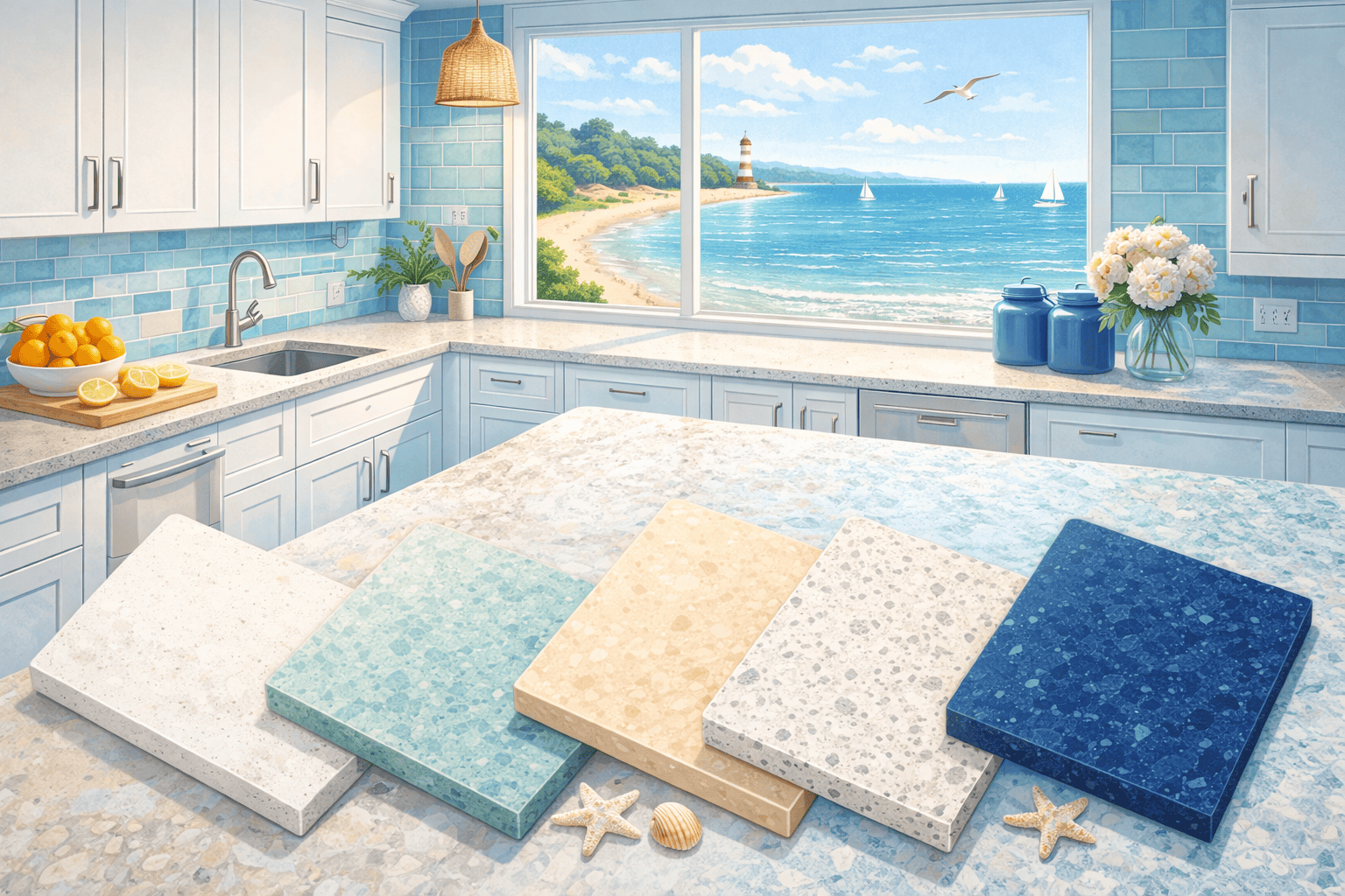
Crisp whites (clean coastal)
Crisp whites are the classic “fresh coastal” look—bright, reflective, and simple. In Delaware beach homes, they can feel like a clean slate against ocean views and airy paint colors. The trick is choosing a crisp white that doesn’t feel clinical in your lighting.
Crisp white quartz typically has minimal warmth and reads as a clean, true white—sometimes with tiny flecks for depth. In strong coastal light, it can look almost luminous.
That’s a plus if you want your kitchen to feel larger and brighter. It can be a minus if you’re sensitive to glare or if your cabinets and walls are warmer whites.
Crisp whites work best when the rest of your palette is intentionally clean: white cabinets, polished chrome or nickel, simple tile, and either light wood or cool-toned flooring. If you’re using coastal blues, crisp white can make them look sharper and more modern.
Best cabinet matches, backsplash pairings, and finishes
Crisp whites pair beautifully with bright white cabinets, light gray cabinets, and navy or deep coastal blue islands. They also work with pale driftwood stains if you keep the rest of the palette neutral-to-cool.
Backsplash choices that usually work well:
- Classic white subway (for timeless coastal)
- Soft gray or white-glass mosaics (for sparkle)
- Matte white zellige-look tile (for texture without pattern overload)
Finish guidance:
- Polishing gives the cleanest “beach light” effect but can create glare.
- Matte/honed softens brightness and fingerprints, great for south-facing kitchens.
Pros:
- Brightens small kitchens and open-concept spaces
- Clean, modern coastal vibe
- Easy to coordinate with many backsplash styles
Cons:
- Shows crumbs, sand, and smudges more than warmer tones
- Can feel stark next to warm floors or creamy paint
- High polish can be reflective in intense daylight
Best for: small kitchens, modern coastal designs, homeowners who love a crisp, fresh look and don’t mind wiping down often—also great for open concepts where you want visual continuity.
Warm whites and off-whites (soft beach cottage)
Warm white quartz is often the sweet spot for quartz countertop colors for coastal Delaware kitchens, especially when you want a relaxed beach-cottage look instead of a high-contrast modern vibe. Warm whites have a gentle creaminess—think soft linen, not bright paper.
In coastal Delaware homes, warm whites feel natural with sandy neutrals, woven textures, and driftwood tones. They’re forgiving in mixed lighting (sunlight + warm under-cabinet lights) and they don’t fight as much with popular coastal paint colors that lean warm or greige.
Off-white quartz countertop colors can range from barely-warm to clearly creamy. The goal is to pick a tone that harmonizes with your cabinets and walls—so it reads as intentional warmth, not “yellowing.”
Warm whites are especially helpful in older beach homes or renovations where trim, floors, or existing tile already has warmth. They also suit homeowners who want a kitchen that feels inviting year-round—even in winter when coastal light can feel cooler and grayer.
Best cabinet matches, backsplash pairings, and finishes
Warm white quartz shines with:
- Creamy white cabinets (not stark white)
- Natural wood cabinets (oak, maple, light walnut)
- Soft blue/green cabinetry (especially muted, gray-leaning coastal shades)
Backsplash pairings that complement warm whites:
- Warm white subway tile with a soft grout
- Handmade-look tile in ivory/cream
- Light beige or greige tile for an even softer blend
- Pale sea-glass accents used sparingly (niche or border)
Finish guidance:
- Matte/honed often looks especially “beach-cottage,” softening reflections.
- Polishing can still work if the kitchen needs extra bounce and brightness.
Pros:
- Softer on the eyes in bright coastal light
- Hides everyday crumbs better than pure white
- Works beautifully with driftwood, rattan, and warm metal finishes
Cons:
- Can look too creamy if paired with bright white cabinets
- Needs careful paint coordination to avoid “yellow vs pink” clashes
Best for: beach cottage kitchens, family homes, homes with warm floors, and rentals where you want a warm, welcoming feel with less visual maintenance stress.
Cream and ivory (classic coastal traditional)
Cream and ivory quartz countertop colors are having a quiet comeback in coastal design because they feel timeless, calm, and tailored—especially in Delaware homes that lean traditional (think: classic trim, inset cabinetry, beadboard details, or heritage-inspired renovations).
These tones are more noticeably warm than off-white, but modern quartz options keep them from feeling heavy. They read like soft coastal sand, linen, or aged shell tones rather than “yellow.” In bright light, cream quartz can glow softly instead of glaring, which is a major win in sun-filled kitchens near the shore.
Cream and ivory work particularly well when your kitchen includes other warm elements: oak flooring, brass hardware, warm white walls, or natural stone-look tile. They also pair beautifully with muted coastal blues and sage greens, creating that relaxed “collected” look.
The key is keeping your supporting palette intentional. If you pair cream quartz with cool gray LVP and icy white trim, the cream can stand out too much. But when the room leans warm-neutral, cream feels like it belongs.
Best cabinet matches, backsplash pairings, and finishes
Cabinet pairings that make cream/ivory look elevated:
- Creamy white cabinets (tone-on-tone elegance)
- Warm greige cabinets (soft contrast)
- Natural oak or light walnut (classic coastal warmth)
- Muted navy island + creamy perimeter cabinets
Backsplash ideas that fit:
- Ivory subway tile with warm grout (classic and easy)
- Soft beige zellige-look tile (adds texture without shouting)
- Warm marble-look porcelain tile (for traditional coastal polish)
Finish guidance:
- Matte/honed gives an understated, heritage feel.
- Polished works for a more formal coastal traditional look—especially with classic lighting.
Pros:
- Forgiving and cozy in all-day sunlight
- Hides minor mess better than pure white
- Timeless for coastal traditional homes
Cons:
- Needs careful coordination with cool flooring/paint
- Can feel “too warm” if you wanted a bright modern coastal look
Best for: traditional beach homes, homeowners who want warmth without trendiness, and kitchens with warm wood floors or brass accents.
Sand and beige tones (dune-inspired)
Sand-colored quartz countertops are a natural match for Delaware coastal living because they echo the landscape—dunes, boardwalks, pale grasses, and weathered wood. These tones feel grounded and practical, especially in homes where sand and daily traffic are unavoidable.
Beige and sand quartz options range from soft greige to warmer tan-sand blends. The best choices for coastal Delaware kitchens tend to be light-to-mid sand tones that still keep the kitchen bright, but don’t punish you for living in it.
This color family is one of the most forgiving for high-traffic kitchens. Sand tones hide crumbs, small smudges, and tiny bits of grit better than white. They also coordinate easily with popular coastal flooring like warm LVP, oak, or beige tile.
Sand and beige quartz can read more “modern organic” or more “classic coastal” depending on your cabinets and hardware. Pair with white cabinets for airy contrast, or pair with natural wood for a relaxed beach-house feel.
Best cabinet matches, backsplash pairings, and finishes
Cabinet matches that sing with sand tones:
- Bright or warm white cabinets (soft contrast)
- Driftwood or natural oak cabinets (seamless coastal)
- Soft greige cabinets (quiet, sophisticated)
- Muted green cabinets (coastal nature palette)
Backsplash ideas:
- Warm white or ivory subway tile
- Textured ceramic tile in cream or greige
- Light stone-look porcelain in a matte finish
Finish guidance:
- Matte/honed emphasizes the dune-inspired softness.
- Polished can look more upscale but may highlight pattern differences more.
Pros:
- Excellent at hiding sand and everyday mess
- Cozy and coastal without being “theme-y”
- Easy to coordinate with warm floors and woven textures
Cons:
- Can feel a bit flat if everything else is beige—needs contrast (hardware, backsplash texture, island color)
- Some beige tones can read pink or yellow if undertones aren’t right
Best for: quartz countertops for Delaware beach homes with heavy traffic, families, rentals, and homeowners who want a forgiving, relaxed look.
Soft grays (modern coastal)
Soft gray quartz is a favorite for modern coastal kitchens because it feels airy and tailored without being stark. In Delaware coastal light, the right soft gray can look sophisticated and calm—especially when paired with white cabinets, pale wood floors, and brushed metal finishes.
The challenge is that gray is extremely undertone-sensitive. A soft gray quartz can lean blue, green, or purple depending on lighting and surrounding colors. In north-facing kitchens, gray can look cooler and more “steel.” In south-facing kitchens, it can warm up and read more greige.
Soft gray works especially well in open concept homes where you want the kitchen to flow into living spaces with neutral upholstery and light wood. It can also make coastal blues and sea-glass accents feel more grown-up and less cottagey.
If you want a “clean coastal” look but pure white feels too high maintenance, soft gray is often the compromise—still bright, but more forgiving for daily life.
Best cabinet matches, backsplash pairings, and finishes
Cabinet matches:
- White cabinets (classic modern coastal)
- Light gray cabinets (monochrome calm)
- Natural oak cabinets (beautiful contrast)
- Navy/blue islands (crisp but not harsh)
Backsplash pairings:
- White subway with cool or neutral grout
- Pale gray glass or ceramic mosaics
- White handmade-look tile (adds warmth and texture)
Finish guidance:
- Matte/honed softens gray and reduces glare.
- Polished looks sleek, but watch reflections in bright beach light.
Pros:
- Less crumb-showing than crisp white
- Modern coastal vibe that works with blues/greens
- Helps define the kitchen in open layouts
Cons:
- Undertones can clash with coastal paint colors if not tested
- Can feel too cool if your floors and cabinets are warm
Best for: modern coastal renovations, open concept layouts, homeowners who want a little more forgiveness than white without going beige.
White with subtle veining (marble-look coastal)
Marble-look quartz—white with subtle veining—can be stunning in a coastal Delaware kitchen. It brings softness and movement, and it can elevate a simple Shaker kitchen into something more designer-feeling without becoming fussy.
For coastal spaces, the most timeless choice is subtle, fine veining rather than dramatic, high-contrast streaks. Strong veining can overpower smaller kitchens and can feel busy in open concept homes that already have patterned flooring or textured backsplashes.
Veining style matters:
- Soft, feathery veining feels breezy and coastal.
- Long, linear veining feels modern and upscale.
- Dense, high-contrast veining can feel dramatic (and trend-sensitive).
This family is also practical: subtle veining helps hide crumbs and light smudges better than a solid pure white. It’s a common reason designers recommend marble-look quartz for beach homes that want a light palette but need daily-life forgiveness.
Best cabinet matches, backsplash pairings, and finishes
Cabinet matches:
- White cabinets (classic, layered whites)
- Warm white cabinets (soft, beachy)
- Light oak (high-end coastal organic)
- Navy island + white perimeter (iconic coastal contrast)
Backsplash pairings:
- Simple white tile (let the quartz be the “pattern”)
- Honed stone-look porcelain in a quiet tone
- Matte zellige-look tile in warm white (texture without competing)
Finish guidance:
- Polishing enhances veining and looks luxurious.
- Matte/honed reads softer and more relaxed, great for beach-cottage styles.
Pros:
- Adds depth and hides everyday mess better than solid white
- Timeless coastal elegance when veining is subtle
- Works across many cabinet colors
Cons:
- Dramatic veining can date quickly
- Busy veining + busy backsplash can feel chaotic
Best for: homeowners who want a “designer coastal” look, open concept kitchens needing subtle movement, and beach homes balancing style with practicality.
Sea-glass inspired accents (how to use without overpowering)
Sea-glass palettes—soft blue-green tones—are a coastal classic, but using them in quartz requires restraint. Most people don’t actually want a fully colored sea-glass countertop in a Delaware beach home kitchen. They want that coastal feeling—without committing to a trend that might feel dated later.
The best approach is to use sea-glass color as an accent and keep countertops neutral. That gives you flexibility: you can refresh paint, textiles, and decor over time without replacing stone.
If you do want a quartz surface that nods to sea-glass, look for:
- Neutral bases with gentle blue/green flecks or undertones
- Very subtle tinting rather than full saturation
- Pairings that feel natural (light woods, warm whites, brushed metals)
Sea-glass works beautifully in backsplashes, islands, or small “moments” like a wet bar, but it can overwhelm a full kitchen if it becomes the loudest element—especially in open concept layouts.
Best cabinet matches, backsplash pairings, and finishes
Cabinet matches:
- Warm white cabinets (most forgiving)
- Light natural oak (organic coastal)
- Pale gray cabinets (modern coastal)
- Muted blue-green islands (layered coastal color)
Backsplash ideas:
- Keep it calm if the countertop has any tint: warm white tile, simple shapes
- If the countertop is neutral: sea-glass backsplash tile in a niche or behind the range
- Use textured matte tiles to avoid a “too shiny beach theme” feel
Finish guidance:
- Matte/honed usually looks more natural and less “glassy.”
- Polishing can amplify color and reflectivity—use cautiously in bright rooms.
Pros:
- Adds personality and a true coastal vibe
- Can be done tastefully with subtle accents
- Works well for bars, small islands, or feature areas
Cons:
- Full-surface color can date quickly
- Competes with other coastal colors if not balanced
Best for: designers and homeowners who want coastal personality without going literal—especially when used as an accent rather than the main countertop statement.
Delaware beach home priorities: high-traffic performance and “looks clean longer”
If you’re choosing coastal Delaware kitchen quartz countertops with daily wear in mind, prioritize two things: forgiveness and consistency.
Forgiveness means the surface doesn’t spotlight every crumb, streak, and sand grain. In beach homes, that usually points to:
- Warm whites/off-whites
- Cream/ivory tones
- Sand/beige tones
- White with subtle veining (not solid bright white)
Consistency means the pattern won’t look “patchy” across seams, corners, or long runs. Very busy patterns can create seam challenges, and extremely uniform colors can reveal shadows and glare.
For rentals, think about the reality of use:
- People will set things down quickly.
- Cleaning may not be as careful as you’d be.
- Guests may use harsh cleaners unless you label what to use.
So for rentals, a slightly warmer tone with subtle movement is usually the smartest choice. It reads clean, hides daily mess, and stays visually calm.
Also consider edge profiles and finish. A highly polished bright white quartz with sharp edges can look amazing, but it shows fingerprints and glare. A softer edge profile and a matte finish often “wear” better visually in a busy coastal kitchen.
Design pairings and palettes (12 complete coastal Delaware combos)
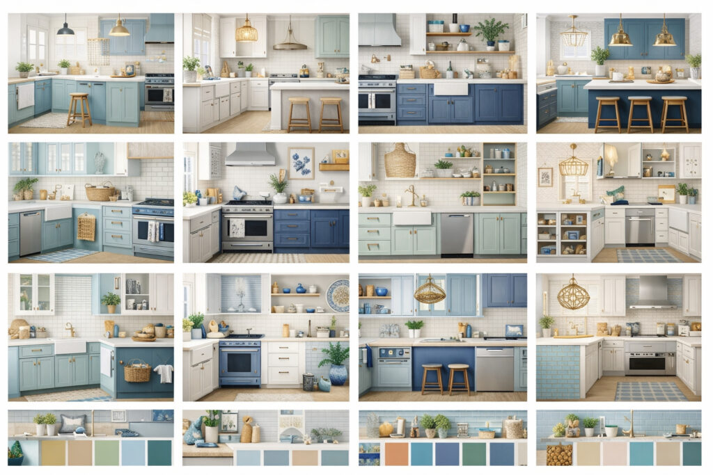
Below are complete “plug-and-play” palettes you can use as a starting point. Treat these as directionally helpful rather than rigid rules—your lighting and fixed finishes should make the final call.
Rehoboth Bright White (crisp, modern coastal)
- Countertop: crisp white quartz (subtle grain if possible)
- Cabinets: bright white Shaker
- Hardware: polished nickel or chrome
- Backsplash: classic white subway, stacked or traditional
- Paint: clean neutral white (avoid creamy undertones)
- Flooring: light oak or cool-neutral LVP
This palette is fresh and modern, especially in condos and newer builds. Add warmth with wood stools or woven pendants to keep it from feeling too clinical.
Lewes Warm Cottage (soft and welcoming)
- Countertop: warm white/off-white quartz
- Cabinets: warm white or cream
- Hardware: brushed brass or aged brass
- Backsplash: warm white handmade-look tile
- Paint: soft greige-white with warm undertone
- Flooring: natural oak or warm LVP
This is a classic “beach cottage” look that feels easy year-round. It’s also rental-friendly because it hides minor mess better than crisp white.
Bethany Sand & Driftwood (dune-inspired and forgiving)
- Countertop: sand/beige quartz with subtle movement
- Cabinets: white perimeter + driftwood island (or all driftwood)
- Hardware: brushed nickel
- Backsplash: ivory subway with warm grout
- Paint: warm, sandy off-white
- Flooring: warm oak or sand-toned tile
Great for homes with heavy beach traffic. It feels grounded, coastal, and low-stress.
Fenwick Soft Gray Coastal (sleek but relaxed)
- Countertop: soft gray quartz (neutral undertone)
- Cabinets: bright white
- Hardware: matte black or brushed nickel
- Backsplash: matte white tile, simple shape
- Paint: soft neutral white (not yellow)
- Flooring: pale oak or cool-neutral LVP
This is modern coastal without harshness. Use warm wood accents to keep it from feeling too cool.
Dewey Navy Island Classic (iconic coastal contrast)
- Countertop: white with subtle gray veining
- Cabinets: white perimeter + navy island
- Hardware: polished nickel
- Backsplash: simple white subway (quiet)
- Paint: clean white with slight warmth
- Flooring: light oak
This palette is a crowd-pleaser and photographs well—helpful if you rent or plan to sell.
Broadkill Cream Tradition (classic coastal traditional)
- Countertop: cream/ivory quartz
- Cabinets: soft white or cream inset-style
- Hardware: aged brass or antique bronze
- Backsplash: ivory subway or stone-look porcelain
- Paint: warm neutral (avoid cool gray)
- Flooring: medium-light oak
This feels timeless and elegant—perfect for classic Delaware coastal homes with traditional trim.
Sea-Green Nook Accent (subtle sea-glass without the theme)
- Countertop: warm white quartz
- Cabinets: warm white
- Hardware: brushed brass
- Backsplash: sea-glass tile in a niche only (or behind a beverage station)
- Paint: soft warm white
- Flooring: light oak
You get a coastal personality in a contained way. Easy to update later.
Oyster Shell Minimalist (calm, airy, contemporary)
- Countertop: off-white quartz (neutral-warm)
- Cabinets: flat-panel warm white
- Hardware: brushed nickel, minimal pulls
- Backsplash: large-format matte porcelain, warm white
- Paint: very light neutral
- Flooring: pale oak
This palette leans contemporary but still feels beach-appropriate because of the warmth.
Boardwalk Black Accents (high-contrast but not harsh)
- Countertop: warm white quartz with subtle movement
- Cabinets: white
- Hardware: matte black
- Backsplash: white tile with slightly warm grout
- Paint: soft neutral white
- Flooring: natural oak
Matte black can look crisp in coastal homes if the countertop isn’t icy-white.
Harbor Greige Blend (easy, cohesive, resale-friendly)
- Countertop: light sand/greige quartz
- Cabinets: soft white or light greige
- Hardware: brushed nickel
- Backsplash: warm white subway
- Paint: greige-white (matching undertone)
- Flooring: warm LVP
This is one of the safest “everything works” palettes for mixed materials and varied lighting.
Surfside Scandinavian Coastal (light wood + soft veining)
- Countertop: white quartz with fine, feathery veining
- Cabinets: light oak slab or Shaker
- Hardware: brushed nickel
- Backsplash: matte white zellige-look tile
- Paint: soft neutral white
- Flooring: light oak (similar family, slightly different tone)
This feels elevated and modern, but still relaxed and beachy.
Canal View Calm (low-glare, low-stress)
- Countertop: warm white quartz in matte/honed finish
- Cabinets: warm white
- Hardware: brushed brass or brushed nickel
- Backsplash: warm white matte tile
- Paint: warm off-white
- Flooring: warm oak or textured tile
If your kitchen gets intense sunlight, this palette reduces glare and keeps the room calm.
Mistakes to avoid in coastal Delaware kitchens

Even beautiful quartz can look wrong if the undertones and finishes aren’t aligned with your space. These are the most common pitfalls—and how to sidestep them.
Picking “too white” or too cool in a warm room
If you have warm oak floors, warm LED lights, creamy trim, or beige tile, a cool crisp white quartz can look stark and slightly blue. It can also make your cabinets look yellow by comparison.
Fix: choose warm white/off-white or a neutral white with subtle movement.
Ignoring undertones between paint, tile, and quartz
A coastal blue paint might have a green undertone; your quartz might have a pink-beige undertone; your backsplash might have a creamy undertone. Together, they can look mismatched even if each piece looked fine alone.
Fix: compare samples together in your kitchen light—especially near windows and under evening lighting.
Overdoing dramatic veining
Heavy, high-contrast veining can dominate a small kitchen and feel busy in open concept homes. It can also be trend-sensitive.
Fix: for coastal homes, favor subtle veining styles—fine, feathery, or gentle linear movement.
Trendy colors that date quickly
Bold colored countertops can feel like a “moment.” In beach homes, where the vibe is often timeless and rental-friendly, neutrals tend to age better.
Fix: keep countertops neutral; bring color into paint, tile accents, stools, and decor.
Mismatching quartz with blue/green paints
Blue and green are coastal staples, but they’re tricky with undertones. Cool grays can make greens look muddy; warm creams can make some blues look dull.
Fix: test the quartz sample directly against your paint sample at different times of day.
Choosing the wrong finish for glare
Polished quartz can be gorgeous, but in bright coastal kitchens it can reflect windows and look glaring—especially on large islands.
Fix: consider matte/honed finishes for south- and west-facing rooms, or if you’re sensitive to shine.
Buying checklist: the details that make the install feel high-end
Quartz selection isn’t only color. The details below affect daily function, visual flow, and long-term satisfaction—especially in beach homes.
Thickness, edge profiles, and the “feel” of your kitchen
Common thickness options are about the look you want and how you plan to detail edges.
- Thicker looks can feel more substantial and “custom.”
- Standard thickness often looks clean and modern, especially with simple Shaker cabinets.
Edge profile choices:
- Eased/straight edge: modern, clean, coastal minimal
- Slight bevel: classic without being ornate
- Ogee/curved edges: more traditional (use carefully in coastal kitchens)
If your home leans beach cottage, slightly softened edges can look more natural and forgiving.
Waterfall vs standard: when it’s worth it
A waterfall edge on an island can look stunning in open concept beach homes—especially with subtle veining or a calm pattern. But it’s more material and labor, and it creates more visible surface area (and potentially more glare if polished).
Worth it when:
- The island is a centerpiece in your open layout
- You’re using a subtle pattern that looks good vertically
- You want a more “designer” statement without bold color
Skip it when:
- Your pattern is busy and looks chaotic vertically
- Your budget is tighter and you’d rather upgrade lighting or backsplash
Seam placement and pattern matching
Seams are normal, but they should be planned thoughtfully:
- Avoid placing seams right at the sink if possible
- Plan seams away from the most visible “hero” angles
- If you have veining, ask how the fabricator handles pattern alignment
Sink color, faucet finish, and hardware cohesion
Coastal Delaware kitchens often look best when finishes are consistent and calm.
Sink options that pair well with coastal palettes:
- Undermount stainless (timeless and practical)
- White or off-white composite sinks (softer cottage look)
- Neutral-toned sinks that coordinate with warm quartz (less contrast)
Faucet finishes that stay timeless:
- Brushed nickel (coastal classic)
- Polished nickel/chrome (crisp and bright)
- Brushed brass (warm cottage/traditional)
- Matte black (modern accent—works best with warmer whites)
Warranty, samples, and comparing in your own light
When comparing samples:
- View in morning, midday, and evening
- Check under-cabinet lighting on and off
- Place sample next to cabinet door, paint swatch, and flooring
- Look at it from standing height, not only close up
This is the step that prevents expensive regret.
Care and maintenance for coastal environments
Quartz is one of the easiest surfaces for busy homes, but “easy” doesn’t mean “anything goes.” Coastal living adds a few habits worth adopting.
Daily cleaning that keeps quartz looking new
For daily cleaning:
- Use a soft cloth or sponge and mild soap with warm water
- Wipe spills sooner rather than later, especially oils and sauces
- Dry the surface if you notice water spots in strong light
Avoid abrasive scrubbers. Even though quartz is durable, harsh scouring can dull the finish over time, especially on matte surfaces.
Avoid harsh chemicals and “rental guest cleaners”
Common products to avoid (or use very cautiously):
- High-alkaline cleaners
- Abrasive powders
- Strong solvents not intended for stone surfaces
If you have a rental, consider leaving a simple note in the kitchen with what to use—guests often grab whatever is under the sink.
Heat precautions and coastal cooking realities
Quartz can handle normal kitchen use, but direct heat is still a risk.
- Always use trivets for hot pots and sheet pans
- Be careful near toaster ovens and air fryers—heat can concentrate in one spot
Sand, grit, and scratch prevention
Quartz is scratch resistant, but sand is gritty. In beach homes:
- Use a doormat and a runner where traffic enters the kitchen
- Encourage “shake off sand” habits (even informally)
- Use cutting boards (good practice everywhere)
Budget guidance: what affects price and where to spend vs save
Quartz pricing varies widely based on the look you choose and the complexity of installation—not just the slab itself. In coastal homes, where you may be balancing durability and aesthetics, it helps to spend strategically.
What impacts total quartz cost most
Key cost drivers typically include:
- Pattern complexity (especially marble-look veining)
- Number of seams and cutouts (sinks, cooktops, outlets on waterfall ends)
- Edge profiles (simpler edges cost less)
- Waterfall edges (more material + labor)
- Installation complexity (tight spaces, older homes, leveling issues)
A simpler, more uniform quartz is often less expensive than a dramatic veined look, but availability and local fabrication factors also matter.
Where it’s worth spending
Consider spending more on:
- A color/pattern you truly love and will keep long-term
- Better seam planning and fabrication quality
- A finish that suits your light (often worth it for comfort)
- Upgraded sink/faucet if those are daily-use pain points
Where you can save without regret
Often safe places to save:
- Choose a simpler edge profile
- Skip waterfall if the budget is tight
- Keep backsplash tile simple and invest in great grout and installation
- Pick a timeless neutral rather than a bold “statement” slab
For many Delaware beach homes, a warm white or sand tone with subtle movement delivers the best balance of coastal style, forgiving maintenance, and long-term appeal—without requiring the highest-end veining.
How to choose in 10 minutes (summary)
If you’re standing in a showroom overwhelmed, use this fast method:
- Decide your vibe: crisp modern coastal or soft beach cottage.
- Match the undertone to your cabinets: bright white cabinets → crisp/neutral whites; creamy cabinets → warm whites/ivory.
- Match to your floor temperature: warm floors → warm quartz; cool floors → neutral/cool quartz.
- Choose forgiveness level: heavy traffic/rental → warm whites, sands, subtle veining.
- Check glare: big windows → consider matte/honed or subtle movement.
- Pick backsplash strategy: if quartz has veining, keep backsplash quiet.
Printable-style checklist
- Kitchen exposure: North / South / East / West
- Natural light strength: Low / Medium / High
- Cabinet color: Bright white / Warm white / Wood / Color
- Flooring: Warm wood / Cool LVP / Beige tile / Other
- Wall paint undertone: Warm / Cool / Neutral
- Countertop undertone: Warm / Cool / Neutral
- Pattern: Solid / Subtle movement / Subtle veining / Dramatic veining
- Finish: Polished / Matte (honed)
- Backsplash plan: Blend / Contrast / Texture accent
- Lifestyle: Full-time / Rental / High-traffic family / Low-traffic
- Sand/crumb tolerance: Low / Medium / High
- Sample test at home (morning + afternoon + evening): Yes / No
- Seam plan reviewed: Yes / No
- Sink + faucet finishes chosen: Yes / No
FAQs
Q1) What quartz colors look best in a coastal kitchen?
Answer: The best choices usually fall into a few “coastal-friendly” families: warm whites, off-whites, creams/ivories, sand tones, soft grays, and whites with subtle veining. These colors stay light and airy, which suits beach-home architecture and strong natural light.
In Delaware coastal homes specifically, warm and neutral tones often feel most natural because they echo sand and driftwood finishes and coordinate easily with coastal paint palettes. If you love crisp modern looks, crisp whites can be gorgeous—but they’re less forgiving for sand and crumbs.
A helpful rule: if you want your kitchen to look calm even when it’s not spotless, choose warm white, cream/ivory, sand tones, or subtle veining.
Q2) Is pure white quartz too bright for beach homes?
Answer: It can be—especially in kitchens with large windows, white cabinets, and reflective surfaces. In bright coastal light, pure white quartz can look intensely bright and may highlight every crumb or smudge.
That doesn’t mean you must avoid it. If you love the look, choose either:
- A crisp white with subtle grain, or
- A white with very subtle veining to add forgiveness.
Also consider finishing. A matte or honed finish can reduce glare and make a bright white feel softer and more comfortable in a sunlit beach kitchen.
Q3) Warm white vs cool white: which works better with coastal blues?
Answer: Most coastal blues—especially the softer, grayer “shoreline” blues—pair beautifully with warm white or neutral white quartz. Warm whites keep the palette relaxed and beachy rather than stark.
Cool whites can work if your overall scheme is also cool: cool gray flooring, crisp white trim, cooler lighting, and modern styling. If your home has warm oak floors or warmer whites elsewhere, cool white quartz can feel disconnected.
When in doubt, neutral-to-warm quartz is usually the safer choice with coastal blues.
Q4) What quartz hides sand and crumbs best?
Answer: For Delaware beach homes, the most forgiving options are:
- Sand/beige tones
- Warm whites/off-whites with subtle movement
- Cream/ivory tones
- White with subtle veining (not solid bright white)
Solid pure white—especially in polished finish—shows the most. Soft grays can hide some crumbs but may show flour-like dust and can shift undertones depending on light.
If sand is a daily reality, a light sand tone or warm off-white with gentle patterning is often the happiest medium.
Q5) Best quartz for rental beach homes in Delaware?
Answer: For rentals, choose quartz that looks good with quick cleaning and varied use. The best rental-friendly choices are:
- Warm whites/off-whites
- Sand/beige tones
- White with subtle, fine veining
These options balance the bright coastal look renters expect with practical forgiveness. Avoid ultra-polished pure white if you worry about smudges, and avoid very dramatic veining that can look busy or trend-sensitive.
Also keep backsplash and grout practical—simple tile and mid-tone grout can reduce maintenance stress.
Q6) Polished vs matte in bright coastal light?
Answer: Polished quartz reflects more light, which can make kitchens feel bright and crisp—but it can also create glare in rooms with big windows, especially on large islands.
Matte (honed) quartz looks softer and more relaxed. It can reduce glare and sometimes hides fingerprints better, but it may show certain smears differently depending on the specific surface texture.
If your kitchen gets intense afternoon sun (west-facing) or has large sliders, matte is often more comfortable. If your kitchen is smaller or darker, polished can help bounce light.
Q7) What backsplash works with white quartz in coastal kitchens?
Answer: If your quartz is solid white or lightly patterned, you have lots of options:
- White subway tile (classic)
- Handmade-look warm white tile (beach cottage)
- Soft gray tile (modern coastal)
- Sea-glass accents in small doses (niche or feature strip)
If your quartz has veining, keep backsplash quieter—simple shapes, low contrast, and minimal pattern. Coastal kitchens feel best when at least one major surface is calm.
Grout matters too: warm grout with warm whites, cooler grout with cooler whites, and avoid stark high-contrast grout unless you want a graphic look.
Q8) Are cream/ivory quartz tops outdated or coming back?
Answer: Cream and ivory are coming back—especially in “warm coastal” and “modern traditional” designs. The key difference is how they’re styled today: cleaner cabinet lines, updated hardware, calmer backsplashes, and more intentional undertone matching.
In a Delaware coastal kitchen, cream quartz can feel timeless because it echoes sand and shell tones and softens bright light. It’s especially beautiful with warm oak floors and brass accents.
If you worry about “dated,” keep the rest of the design streamlined and avoid overly ornate edges or busy backsplash patterns.
Q9) How do I match quartz undertones to paint?
Answer: Use a simple test:
- Place the quartz sample vertically against the wall paint sample.
- Look in natural daylight and under evening lights.
- Ask: does the quartz look pink, yellow, blue, or gray next to the paint?
If the quartz suddenly looks yellow, your paint may be cooler. If the quartz looks blue, your paint may be warmer. Your goal is either:
- Matching undertones (harmonious), or
- Intentional contrast (crisp modern look)
Always test at home. Coastal light can change everything.
Q10) What’s the safest quartz color for resale in coastal Delaware?
Answer: Generally, neutral-warm whites and subtle veining have broad appeal:
- Warm white/off-white
- White with subtle veining
- Light sand/greige tones
These work across many cabinet styles and feel coastal without being theme-driven. They also photograph well, which matters for resale and rentals.
If your home is very modern, crisp white or soft gray can also be resale-friendly—just make sure undertones coordinate with floors and paint.
Q11) Can I use soft gray quartz with warm wood floors?
Answer: Yes—if the gray is truly neutral (not strongly blue) and if you add warmth elsewhere (warm white walls, warm metals, woven textures). Soft gray can look elegant with oak, but undertones must be tested in your lighting.
If the gray leans blue, it can clash with warm wood and make the kitchen feel colder. In many Delaware beach homes with warm natural materials, a greige-leaning gray often works best.
Bring home samples and view them next to your floor—especially in afternoon light.
Q12) Do I need veining for a coastal look?
Answer: Not necessarily. Coastal style is more about lightness, calmness, and natural texture than about veining itself. Solid warm whites, creams, and sand tones can look incredibly coastal when paired with the right cabinets, hardware, and backsplash texture.
Veining can help add movement and can hide crumbs better than a solid pure white, but it isn’t required. If your floors or backsplash already have visual texture, a calmer countertop may be the better coastal choice.
Q13) What quartz countertop color works best in a small coastal kitchen?
Answer: To make a small kitchen feel open, choose:
- Warm white/off-white
- Crisp white with subtle grain
- White with subtle veining
These reflect light and reduce visual boundaries. If you want more forgiveness than pure white, subtle veining or gentle movement is a great compromise.
Also consider matching the backsplash and wall color closely to reduce contrast—coastal small kitchens often feel best when surfaces blend softly.
Q14) Should I choose a lighter or darker grout with coastal quartz?
Answer: In most coastal Delaware kitchens, a mid-tone grout is the practical sweet spot. Very white grout can stain; very dark grout creates a graphic look that can feel less relaxed.
Match grout undertones:
- Warm quartz → warmer grout
- Cool quartz → cooler grout
- Neutral quartz → either, depending on tile tone
If you’re renting the home or expect heavy use, slightly deeper grout is often more forgiving.
Q15) What are the best quartz colors for beach-style kitchens in Delaware if I have kids and pets?
Answer: For busy households, choose surfaces that hide daily life:
- Sand/beige tones
- Warm whites/off-whites with subtle movement
- Cream/ivory
- White with subtle, fine veining
Pair that with a finish that doesn’t create glare or highlight smudges too much—often matte/honed is a comfortable choice in bright rooms, but polished can still work with the right color and pattern.
Also plan for easy habits: runners near entry points, a broom closet nearby, and clear cleaning instructions if guests help tidy up.
Conclusion
Conclusion: the best picks and your next steps
Coastal Delaware kitchens do best with quartz colors that stay calm in bright light, coordinate with beachy paint palettes, and still look clean after real life—sand, snacks, guests, and all. If you want the most “can’t-go-wrong” options for Rehoboth, Lewes, Bethany, and Fenwick homes, start with these families:
- Warm whites/off-whites: the easiest match for driftwood floors, woven textures, and soft coastal blues
- Sand/beige tones: the most forgiving for high-traffic beach homes and rentals
- White with subtle veining: a marble-look upgrade that hides everyday crumbs without feeling busy
- Cream/ivory: timeless warmth for coastal traditional styles
- Soft grays: a modern coastal choice when undertones align with your flooring and paint
Next steps to lock in the right color
- Pick your top 3–5 samples from the family that fits your cabinets and floors (warm vs cool).
- Test them at home—morning, midday, and evening—under both natural light and your under-cabinet lighting.
- Compare everything together: quartz + cabinet door + paint + backsplash + flooring, side-by-side.
- Choose your finish intentionally: polished for maximum brightness, matte/honed to reduce glare and fingerprints.
- Plan details before ordering: seam placement, edge profile, sink color, and faucet finish so the final install feels cohesive.
When you’re ready, schedule your templating after cabinets are installed and floors are finalized, and keep your favorite sample on-site during install day to confirm you’re getting the exact look you approved.